For your investigation you will need to give an introduction to the contextual background of your data and write a purpose statement.
For example, (from NZQA exemplars):
It has been speculated in the media that the area of sea ice on the planet is decreasing. Is this actually happening? If so what is causing such changes?
How fast is the decrease? What would this mean for the area of sea ice in the Arctic? Would the habitats of animals such as polar bears be destroyed? The natural resources defence council (NRDC) report (http://www.nrdc.org/globalwarming/qthinice.asp) states that although local temperatures fluctuate naturally, over the past 50 years the average global temperature has increased at the fastest rate in recorded history. Other impacts will include sea level rise, decreases in the amount of sea ice and more frequent and intense storm events.
I am going to investigate whether or not there is a decreasing trend in the area of sea ice in the Arctic and if so what is the rate of such a change.
I will use INZIGHT to create a series of times series graphs on the quantity of sea ice in Antarctica (in millions of km squared).
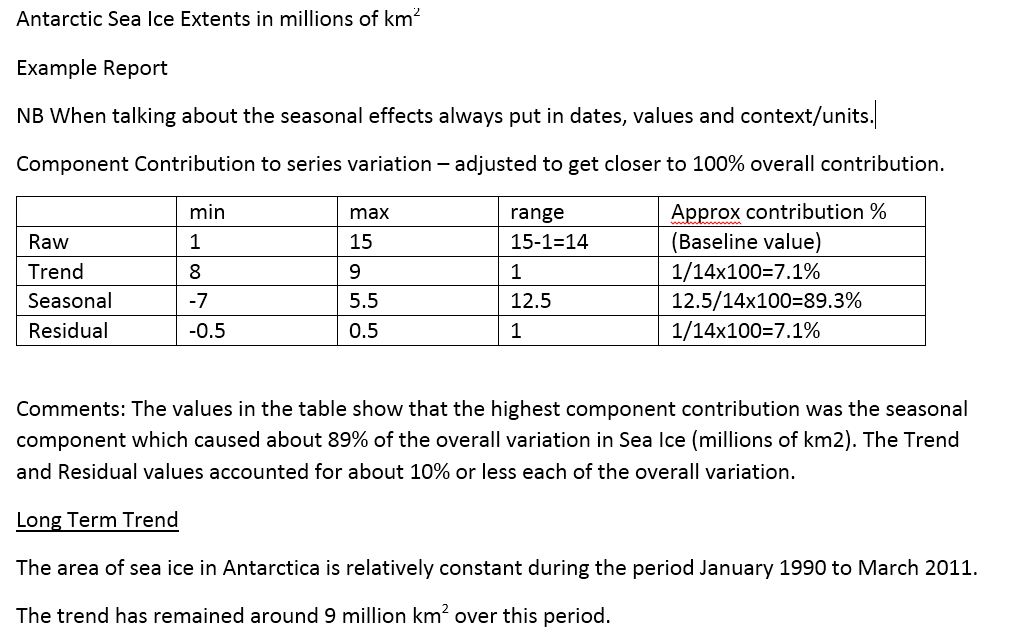
(We then used the graphs to fill in a table of minimum, maximum and range values in order to work out what % of the raw data range was caused by each of the components of Trend, Seasonality and residual values.
Note that the values are approximate as the scales on the graph require us to make rough estimates for each value. Our overall % added up to more than 100%, so perhaps we should have rounded some values down.
These values are also useful to help describe each part component of the data.)
Note that the values are approximate as the scales on the graph require us to make rough estimates for each value. Our overall % added up to more than 100%, so perhaps we should have rounded some values down.
These values are also useful to help describe each part component of the data.)
The graphs:
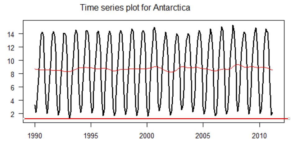
(From this graph we can see that the minimum value for the raw data was about 1 (million square km - see straight red line used as a ruler at the bottom of the graph) and the maximum was about 15 (million square km).
For the trend (the "smooth") - given by the wiggly red line in the middle, the minimum was about 8 and the maximum about 9.5.)
For the trend (the "smooth") - given by the wiggly red line in the middle, the minimum was about 8 and the maximum about 9.5.)
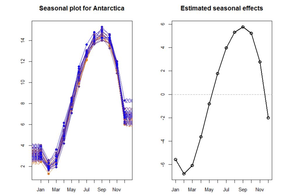
The graph above left gives the amount of variation for each month of each year from the original graph. It also lets us see the similarities and differences between each of the years' cycles.
The graph on the right above give the AVERAGE amount of variation above or below the trend line for each of these months.
The minimum value below the trend line is about -6.5 (million square km) and the maximum is about 5.5 (mil sq km) giving a range of about 12.5 (mil sq km).
The graph on the right above give the AVERAGE amount of variation above or below the trend line for each of these months.
The minimum value below the trend line is about -6.5 (million square km) and the maximum is about 5.5 (mil sq km) giving a range of about 12.5 (mil sq km).
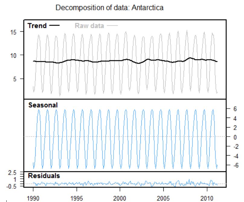
Here is how INZIGHT broke down the data for the Antarctic Sea Ice. At the top is the raw data with its "smooth" trend line. In the middle is the seasonal effect, shown compared to the straightened trend line. Each of these is overlapped in the left hand side of the previous graph.
The bottom part gives the residuals - max 1, min -0.5, range 1.5.
The bottom part gives the residuals - max 1, min -0.5, range 1.5.
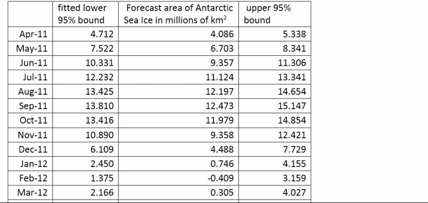
For example, my prediction for the area of Antarctic sea ice April 2011 is 4.7 million km2. I am 95% certain that the true area will be between 4.1 and 5.3 million km2.
Conclusion: After a visual inspection of the recomposed data I am confident that the model provides a good fit as the differences between the fitted data and the raw data are very small. The small size of the residual values, especially in comparison with the overall variation in the area of Antarctic Sea Ice also supports the model being a good fit.
Contextual reflection (from NZQA exemplar) This forecast would be of interest to scientists studying the climatic processes of the Earth, Environmental Groups (e.g Greenpeace) as well as scientist studying animal which lives at the Arctic Region. As the area of Arctic sea ice decreasing would have an impact on the climate of the region, possibly contributing to global warming as the melting of sea ice mean that there is more heat absorbed by the sea water than previously, heating up the ocean. The Arctic Sea Ice is the habitat of Polar Bears and would have an impact on how the polar bears live. Environmental groups may want to alert the general public about the decline in the Arctic Sea Ice to get people to change their lifestyles to lessen their carbon footprints.
My findings of a gradual decrease in the mean area of sea ice in the Arctic are partially supported by other research from NASA which states the area is decreasing by about 4% per decade. They also identified a record low for the mean area of sea ice in the Arctic in 2007 but a possible reason for this was not identified.
More recent research (ref BBC sept 2013) suggests that rather than the area of sea ice, we should be investigating the changing volume of sea ice to get a more reliable assessment of the changes now underway in the northern polar region.
